DigiTools
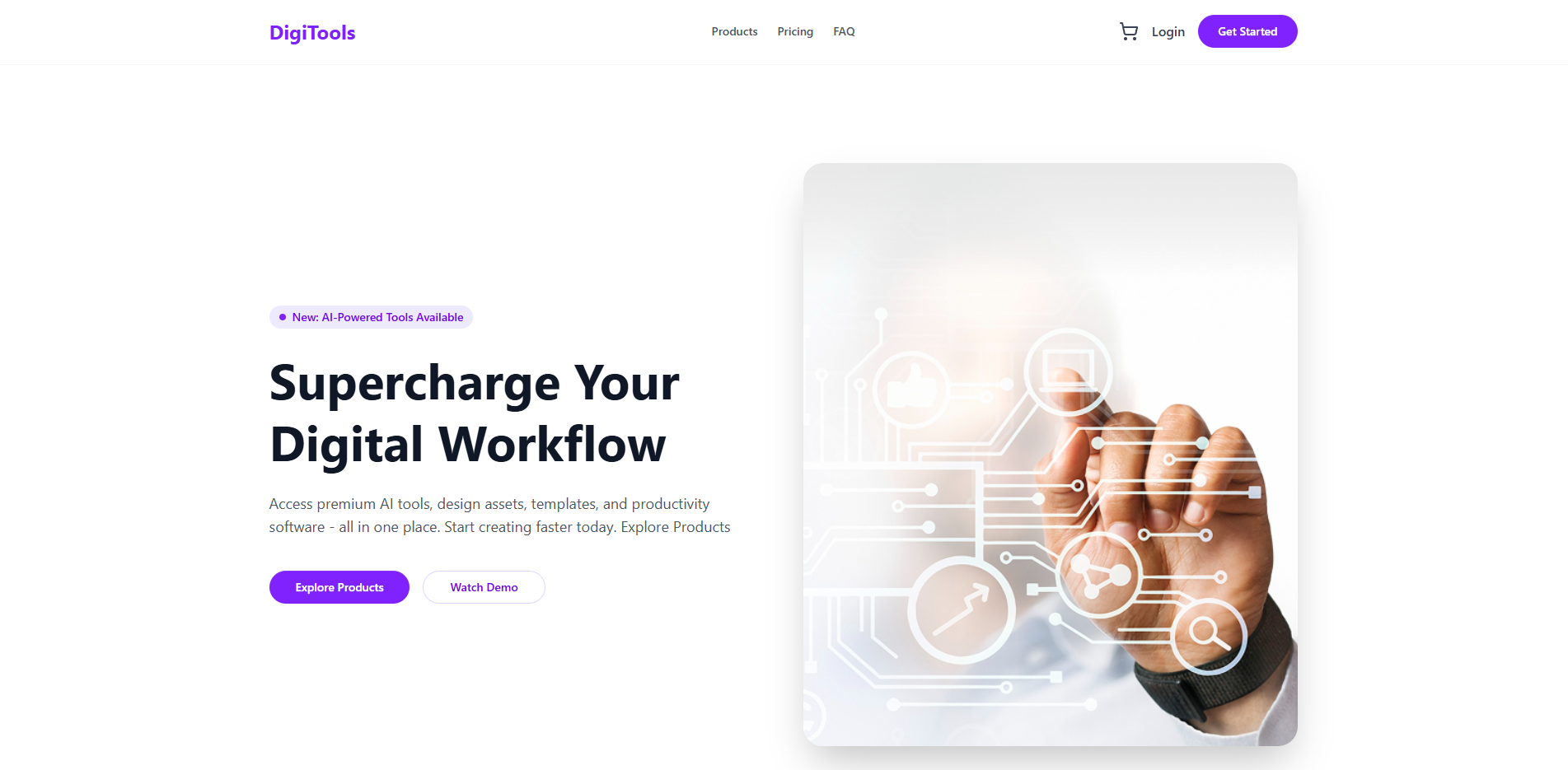
The Vision Behind Digitools
The digital product landscape is vast and often overwhelming. Digitools Platform emerged as a solution to this challenge a modern marketplace designed specifically for developers and tech enthusiasts to browse, compare, and manage digital products with ease.
Digitools focuses on dynamic data rendering and state management. The project demonstrates how to build an interactive product marketplace with real time cart functionality, product filtering, and a seamless user experience.
A Seamless Shopping Experience
Digitools creates a frictionless experience for discovering and purchasing digital products through intuitive navigation and smart state management.
Two central buttons let users switch between Product view and Cart view. By default, the Product section is visible, showing all available digital tools.
The cart dynamically updates with product count in the navbar. Each product added appears in the cart section with name, icon, price, and a remove button for easy management.
Every action add to cart, remove from cart, and checkout triggers a toast notification, providing clear feedback and confirming user actions instantly.
Product Data Architecture
Each product in Digitools is structured with rich metadata that enables dynamic rendering and smart categorization.
{
  "id": 1,
  "name": "Pro Design Suite",
  "description": "Complete design toolkit for professionals",
  "price": 49.99,
  "period": "monthly",
  "tag": "popular",
  "tagType": "popular",
  "features": ["100+ templates", "ATS optimization", "Export to PDF"],
  "icon": "https://example.com/icon.svg"
}
Product Display & Card Design
Products are displayed in a clean, organized grid layout that puts essential information front and center.
Products are displayed in a 3 column grid on large screens, making it easy to browse multiple products at once. Each card shows name, description, price, period, tag, features, icon, and a Buy Now button.
Each card follows a clear visual hierarchy with the product icon at the top, followed by name and description, then pricing information, tags, and features list with the Buy Now button at the bottom.
Smart Cart Management
The cart system in Digitools is designed to be intuitive and responsive, providing real time feedback for every user action.
The cart section displays selected products in a single column layout. Each item shows name, icon, price, and a remove button. The navbar dynamically updates with the total product count.
The "Proceed to Checkout" button calculates the total of selected products and clears all cart items with a confirmation toast notification. This provides a clean, satisfying end to the shopping experience.
Additional features include visual feedback on the Buy Now button showing "Added to cart" message, and automatic cart count updates in the navbar for a polished experience.
Comprehensive Page Architecture
Digitools goes beyond a simple product list with multiple thoughtfully designed sections that create a complete brand experience.
A hero section featuring a compelling heading, description text, supporting image, and call to action buttons that set the tone for the entire platform.
Data driven statistics that build trust and showcase the platform's reach, designed with visual appeal and clear information hierarchy.
A steps section that guides users through the process, followed by a pricing section that presents different options clearly for informed decision making.
Responsive Across All Devices
Digitools is built with a mobile first approach, ensuring a consistent experience across all screen sizes and devices.
Single column layouts with touch friendly buttons and readable typography optimized for smaller screens.
Two column product grids and optimized spacing for medium sized screens like iPads and tablets.
Full 3 column product grids with spacious layouts and enhanced visual hierarchy for large screens.
The Technology Stack
Digitools leverages a modern frontend stack chosen for its efficiency in building dynamic, interactive user interfaces.
| Technology | Purpose |
|---|---|
| React | UI component architecture and state management |
| Tailwind CSS | Utility first styling for rapid development |
| DaisyUI | Component library for consistent UI patterns |
| React Toastify | User friendly toast notifications |
| Lucide React | Clean, consistent icon set |
| Vite | Fast build tool and development server |
Project Architecture
The project follows a clean, component based structure that makes it easy to navigate, maintain, and extend.
kawsarcodes-digitools-platform/
├── README.md
├── eslint.config.js
├── index.html
├── package.json
├── vite.config.js
├── public/
│   └── products.json
└── src/
    ├── App.css
    ├── App.jsx
    ├── index.css
    ├── main.jsx
    └── component/
        ├── Banner.jsx
        ├── CallToAction.jsx
        ├── Cart.jsx
        ├── Footer.jsx
        ├── NavBar.jsx
        ├── Pricing.jsx
        ├── ProductCard.jsx
        ├── Products.jsx
        ├── Stats.jsx
        └── Steps.jsx
Challenges Faced While Developing the Project
Creating a single page application with seamless state synchronization posed several UX and reactivity challenges.
Managing complex cart item state changes and updating total price calculations in vanilla JavaScript required precise event listener management to avoid memory leaks.
Preventing toast notification overlap during rapid item additions involved building an explicit timeout queue mechanism for consistent feedback timing.
Potential Improvements and Future Plans for the Project
Planned enhancements focus on persistent storage integrations and advanced product filtering mechanics.
Saving shopping cart contents to browser local storage so user selections remain intact even after closing or refreshing the browser tab.
Adding multi level category tags and live keyword search inputs to allow instant filtering of digital tool catalogs.